Module 1: Inference for Linear Regression
Module Overview
In this module, we will learn to set up a hypothesis test for the slope term for a linear regression model and how this allows us to determine if there is a statistically significant relationship between the two variables. Finally, we'll discuss sampling variability and the limits of the conclusions we can draw with our data.
Learning Objectives
- Identify the Appropriate Hypotheses to Test for a Statistically Significant Association Between Two Quantitative Variables
- Conduct and Interpret a t-test for the Slope Parameter and Make the Connection Between the t-test for a Population Mean and Slope Coefficient
- Identify the Appropriate Parts of the Output of a Linear Regression Model and Use Them to Build a Confidence Interval for the Slope Term
- Identify Violations of the Assumptions for Linear Regression and Articulate Why Correlation Does Not Imply Causation Inference for Linear Regression
Objective 01 - Identify the Appropriate Hypotheses to Test for a Statistically Significant Association Between Two Quantitative Variables
Overview
The previous module focused on describing the relationship between two variables, calculating a correlation, and fitting a linear regression model to the data. The correlation coefficient and the residuals will inform about the strength of the correlation between the two. But, we haven't yet looked at the statistical significance of how the variables are related.
The focus of this module will be on this topic, and we'll start with hypothesis testing!
What are we testing?
We have fit a linear regression to two variables and then plotted the line on our dataset. The slope parameter represents how the two variables are related. If the slope were zero, we would say there are zero relationships between the variables. As one increases, the other stays at a constant value.
We're going to introduce a new dataset for this module: the car crashes dataset from 539. The variables that we'll consider are the total number of drivers involved in fatal collisions and the factors of speeding and alcohol impairment.
Column descriptions:
- total (Number of Drivers Involved in Fatal Collisions Per Billion Miles)
- speeding (Percentage of Drivers Involved in Fatal Collisions Who Were Speeding)
- alcohol (Percentage of Drivers Involved in Fatal Collisions Who Were Alcohol-Impaired)
Let's load and view this data first and then discuss sample and population statistics.
import seaborn as sns

# Load the car crash dataset
crashes = sns.load_dataset("car_crashes")

# Limit the data to only the columns we need
crashes = crashes[["total", "speeding", "alcohol"]]

# Display the first few rows
crashes.head()| total | speeding | alcohol | |
|---|---|---|---|
| 0 | 18.8 | 7.332 | 5.640 |
| 1 | 18.1 | 7.421 | 4.525 |
| 2 | 18.6 | 6.510 | 5.208 |
| 3 | 22.4 | 4.032 | 5.824 |
| 4 | 12.0 | 4.200 | 3.360 |
To start, we're going to compare the variables total and alcohol. We'll first
implement a linear regression (find the best-fit line) and then look at how we should interpret the
results using inferential statistics.
import seaborn as sns
import matplotlib.pyplot as plt

crashes = sns.load_dataset("car_crashes")
crashes = crashes[["total", "speeding", "alcohol"]]

# Make the scatter plot
sns.lmplot(data=crashes, x="alcohol", y="total", ci=None)

# Display the scatter plot
plt.show()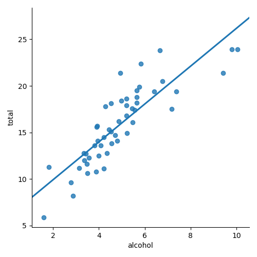
Remember the equation for a line was y = b0 + b1x
For our data, we fit the intercept (b0) and the slope (b1). Now we will make a statistical statement about the slope parameter.
But first, we need to set up our hypothesis and to do that we'll review the terms population and sample.
- population: the entire group that we would like to draw conclusions about
- sample: the subset of the population
In our dataset above, we're looking at just a sample of drivers; we don't have all the data for all drivers and all of their accident records.
Hypothesis Testing: sample and population means
What we're doing with hypothesis testing is to compare a sample mean to some hypothetical population mean. Then, we'd like to evaluate with some level of certainty if we can reject the null hypothesis. In other words, we're testing the hypothetical mean of the population (to reject the null hypothesis or not) and using the sample to do the testing.
But we aren't looking at the sample mean here - we're looking at the slope of the relationship between
our variables. So, if these two variables (total and alcohol) are entirely
unrelated, the slope would be 0 (a flat line). We can then write our null hypothesis as:
null hypothesis = slope is equal to zero
The alternative hypothesis in this case would be that the two variables are related:
alternative hypothesis = slope is not equal to zero.
In the Guided Project, you will learn how to express the null and alternative hypotheses mathematically.
Challenge
Think about a different dataset (you don't need to actually import it) and write out a null hypothesis and alternative hypothesis.
Additional Resources
Objective 02 - Conduct and Interpret a t-test for the Slope Parameter and Make the Connection Between the t-test for a Population Mean and Slope Coefficient
Overview
In the last objective, we looked at two variables from our car crash dataset. We can see that there is a relationship between the variables. We stated our null hypothesis and alternative hypothesis. So, now let's perform the hypothesis test.
Follow Along
In the previous module, we used the scikit-learn LinearRegression() library to fit our
model. While this helped provide a preview on predictive modeling, we need more statistical information
on our linear models.
So instead we'll use the statsmodel library and the Ordinary Least Squares model.
We'll load our data, fit the model, and then look at the output.
import pandas as pd
import seaborn as sns

# Load the car crash dataset
crashes = sns.load_dataset("car_crashes")

mycols = ['total', 'speeding', 'alcohol']

crashes = crashes[mycols]
crashes.head()| total | speeding | alcohol | |
|---|---|---|---|
| 0 | 18.8 | 7.332 | 5.640 |
| 1 | 18.1 | 7.421 | 4.525 |
| 2 | 18.6 | 6.510 | 5.208 |
| 3 | 22.4 | 4.032 | 5.824 |
| 4 | 12.0 | 4.200 | 3.360 |
import warnings
warnings.filterwarnings('ignore')
import statsmodels.api as sm

Y = crashes['total']
X = crashes['alcohol']

# Create the model with the X, Y data
X = sm.add_constant(X)
model = sm.OLS(Y, X)

# Fit the model
results = model.fit()

# Look at the results that include the t-statistic
print(results.t_test([1, 0]))
                             Test for Constraints
==============================================================================
                 coef    std err          t      P>|t|      [0.025      0.975]
------------------------------------------------------------------------------
c0             5.8578      0.921      6.357      0.000       4.006       7.709
==============================================================================
Yay! We fit our linear model, we have the slope (coef in the table), standard error (std err) and the t-value (t). Remember from the previous sprint how the t-statistics is calculated:
where ̄x is the sample mean, μ0 is the mean under the null hypothesis and SE is the standard error. Because we are performing the hypothesis test on the slope parameter, we adjust the t-statistic:
where b1 is the slope in the sample, β1 is the slope under the null hypothesis and SE is the standard error.
Remember that we stated the null hypothesis as there is no relationship between the variables, so the slope (β1) is equal to zero. Let's plug in the numbers and compare what we calculate as the t-statistic to the output in the table above.
It worked! The t-statistic we just calculated agrees with the value of t in the table.
We also don't need to calculate the p-value as it's also given in the table. Because the p value is essentially zero (or rounds to zero) we can reject the null hypothesis. In other words we reject the statement that there is no relationship between the variables.
Additional Resources
Objective 03 - Identify the Appropriate Parts of the Output of a Linear Regression Model and Use Them to Build a Confidence Interval for the Slope Term
Overview
We're going to continue with our car crash dataset. Remember that we have not fit a model and performed a t-test on the slope parameter. The slope measures the relationship between the total number of car crashes and if alcohol use by the driver was a factor. So that's it, right? Not exactly. We want to know how well we know the value for the slope or the confidence we have in the value. If we took a different sample of car crash data, we would likely get an additional slope value.
Now is when confidence intervals come into play!
Confidence Intervals
import seaborn as sns

# Load the car crash dataset
crashes = sns.load_dataset("car_crashes")
crashes = crashes[['total', 'speeding', 'alcohol']]
crashes.head()| total | speeding | alcohol | |
|---|---|---|---|
| 0 | 18.8 | 7.332 | 5.640 |
| 1 | 18.1 | 7.421 | 4.525 |
| 2 | 18.6 | 6.510 | 5.208 |
| 3 | 22.4 | 4.032 | 5.824 |
| 4 | 12.0 | 4.200 | 3.360 |
import seaborn as sns
import statsmodels.api as sm

crashes = sns.load_dataset("car_crashes")
crashes = crashes[['total', 'speeding', 'alcohol']]

Y = crashes['total']
X = crashes['alcohol']

# Create the model with the X, Y data
X = sm.add_constant(X)
model = sm.OLS(Y, X)

# Fit the model
results = model.fit()

# Look at the results that include the t-statistic
print(results.t_test([1, 0]))
Test for Constraints
==============================================================================
coef std err t P>|t| [0.025 0.975]
------------------------------------------------------------------------------
c0 5.8578 0.921 6.357 0.000 4.006 7.709
==============================================================================On the far right of this table, we see a 95% confidence interval (the lower and upper bounds). We would write our slope coefficient as 95% confident that the value lies between 4.006 and 7.709.
Plotting Confidence Intervals
We can use the abilities of the seaborn plotting library to plot the confidence interval on our plot.
But first, we specify at what confidence level we would like to display by using the ci
argument.
Create the scatter plot with the confidence interval
import seaborn as sns
import matplotlib.pyplot as plt

crashes = sns.load_dataset("car_crashes")
crashes = crashes[['total', 'speeding', 'alcohol']]

# Create the scatter plot with the confidence interval
sns.lmplot(data=crashes, x='alcohol', y='total', ci=95)

plt.show()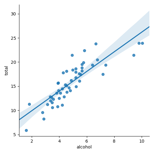
The "true" slope of the line is somewhere within the shaded region.
Challenge
Using the same dataset, try changing the confidence interval on the last plot. If you make the confidence interval bigger (e.g., a more significant number like 99%), will the shaded region increase or decrease? How will reducing the confidence level affect the size of the shaded region?
Additional Resources
Objective 04 - Identify Violations of the Assumptions for Linear Regression and Articulate Why Correlation Does Not Imply Causation Inference for Linear Regression
Overview
Now that we have sufficiently covered how to fit a linear regression model, it's essential to know when not to use one! The following list describes a few cases when linear regression models should be avoided.
Linear Regression: When not to use it
- Categorical data (like a classification)
- Modeling non-linear relationships
- Outliers (without adjusting for them)
Let's go over a few of these examples now, with real datasets, and see what happens when we fit a linear regression model.
Follow Along
Categorical Variables
Not all data is suitable for fitting a linear model. If we have data where we're trying to predict to which class an observation belongs, we should fit a classification model (we'll learn about these in future Sprints). The following dataset and plot are examples of data better suited to a classification model.
import matplotlib.pyplot as plt
import seaborn as sns

dots = sns.load_dataset("dots")
sns.lmplot(data=dots, x="time", y="coherence", ci=95)

plt.show()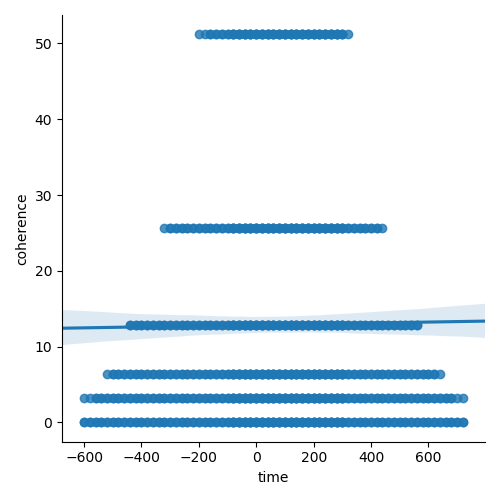
These two variables are not well suited for fitting a linear model. The slope would be zero for each line at a different coherence level. These two variables could be used as part of a classification model, with coherence as one of the features. Always plot your data before you fit a model!
Non-linear Data
Let's look at another example. The hourly temperature in most temperate climate locations varies from an overnight low to a daily high. While we could easily model this type of data, a linear regression would not be a good choice.
import matplotlib.pyplot as plt
import seaborn as sns
import pandas as pd

temps = pd.read_csv("denver_temps.csv")
sns.lmplot(data=temps, x="time", y="temperature", ci=95)

plt.show()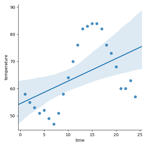
Additional Resources
Guided Project
Open DS_131_Inference_For_Regression.ipynb in the GitHub repository below to follow along with the guided project:
Guided Project Video
Module Assignment
Complete the Module 1 assignment to practice inference for linear regression techniques you've learned.