Module 1: Decision Trees
Module Overview
In this module, you will learn about decision trees, one of the most intuitive and widely used machine learning algorithms. Decision trees are versatile models that can be used for both classification and regression tasks, making them essential tools in a data scientist's toolkit.
You'll explore how decision trees work, from the basic concepts of node splitting to practical implementation using scikit-learn. You'll also learn about the strengths and limitations of decision trees, setting the foundation for more advanced tree-based methods in later modules.
Learning Objectives
- Clean data with outliers and missing values
- Build a Decision Tree using scikit-learn
- Get and interpret feature importances of a tree-based model
Objective 01 - clean data with outliers and missing values
Overview
Cleaning data is an important task when we are beginning any machine learning or data science project. Real-world data is often messy, with missing values, outliers, incorrect values, and many other issues. In this objective we're going to focus on two of the more common problems: outliers and missing values.
An outlier is a data point that is different from the rest of your data set in some way. It can be the result of an error, corrupted data, or a true value that just happens to be different from the rest. When dealing with outliers we first need to identify them and then remove or adjust them. It's important to do this because model training and performance can be affected by outliers, especially if you don't know what type or how many are present in your data.
Identifying Outliers
There are a number of different methods used to identify outliers. In this objective we're not going to go into great detail because these methods depend on the type of data you are working with and also the type of model(s) you are trying to fit. There are however a few basic methods that generally apply when detecting outliers. One of the most common is to perform a statistical analysis to identify data points that are statistically different from the rest. For example, you might assume your data is normally distributed and look for values that are a certain distance from the mean. Extreme values are easy to find and filter out this way if needed.
Another method is to just look at the data. This is something you have likely already done - visualizing your data is an important first step. Depending on the type of data you are working with, a scatter plot or histogram are useful tools to help identify outliers. Some types of plots, such as boxplots, are also a great way to visualize the descriptive statistics of a data set.
Handling Outliers
Once you identify outliers, you need to decide what to do with them. If you don't have a big data set, taking away even just a few data points could affect your model results. Also, some outliers are actually real data and might need to be included in your analysis. However, there are times where the outliers need to be removed, or at least be transformed into a different value.
If you have a large data set and you identify extreme values using statistical methods, it's probably safe to just remove them. If you want or need to keep as much data as possible, you could also transform the outliers. A common method is to apply a log transform where you take the logarithm of an outlier to reduce its effect on analysis.
Outliers aren't the only problem we encounter with real-world data. Often the outliers could be missing values that were replaced with a zero or some other value. Removing or changing these values is important if we want our analysis and models to accurately represent our data.
Missing Values
It would be rare to find a data set that doesn't have missing values. Because there are different ways
to handle missing values, sometimes we end up with NaN values, but other times there could
be a 0 or a 999 or even some random string. It's also important to figure out
why there is a missing value. Is it
because the data wasn't recorded or is it because it didn't make sense to put a value there? For
example, a survey might ask for the age of the youngest child in the house. If a household doesn't have
any children, this value might be left empty.
Missing values can be handled in different ways depending on why they are missing. The above example
would be suitable for replacing with NaN. But what if there is a row of data, where the
column "number of children" is non-zero but the age of the youngest is missing? This data
could have been
recorded but wasn't.
Working with missing data and determining what to do with it will require you to actually look at your
data and to read any associated documentation. The more important your project, the more closely you
will want to look at the missing values.
In the next section, we'll look at a practice data set and identify some outliers and missing values and work through a few examples of how to handle them.
Follow Along
We're going to make use of another data set available in the seaborn library. The "planets" data is from the NASA exoplanet catalog and contains information like the planet's distance from Earth, the planet's mass, and discovery date. This data set contains missing values so it will provide us with a good practice set. We can also use this data to check for outliers or extreme data points that we might not want to include in our analysis.
We'll start by loading the data, looking at the descriptive statistics, and making some plots.
# Imports
import seaborn as sns

# Load the data
planets = sns.load_dataset("planets")
display(planets.head())

# Display some of the general information
display(planets.info())
| method | number | orbital_period | mass | distance | year | |
|---|---|---|---|---|---|---|
| 0 | Radial Velocity | 1 | 269.300 | 7.10 | 77.40 | 2006 |
| 1 | Radial Velocity | 1 | 874.774 | 2.21 | 56.95 | 2008 |
| 2 | Radial Velocity | 1 | 763.000 | 2.60 | 19.84 | 2011 |
| 3 | Radial Velocity | 1 | 326.030 | 19.40 | 110.62 | 2007 |
| 4 | Radial Velocity | 1 | 516.220 | 10.50 | 119.47 | 2009 |
<class 'pandas.core.frame.DataFrame'>
RangeIndex: 1035 entries, 0 to 1034
Data columns (total 6 columns):
 #   Column          Non-Null Count  Dtype
---  ------          --------------  -----
 0   method          1035 non-null   object
 1   number          1035 non-null   int64
 2   orbital_period  992 non-null    float64
 3   mass            513 non-null    float64
 4   distance        808 non-null    float64
 5   year            1035 non-null   int64
dtypes: float64(3), int64(2), object(1)
memory usage: 48.6+ KB
There are a total of 1035 entries in this dataset, and some columns have a non-null count of less than 1035. We definitely have some missing data. We will try to identity what values are missing and where they are located before deciding the next steps.
# Count the missing values
print(planets.isnull().sum())
method              0
number              0
orbital_period     43
mass              522
distance          227
year                0
dtype: int64
There are quite a few missing values in the mass column. For a data set like this, it's
probably because
there is no data available for that particular observation. In that case, we would likely want to drop
rows that have missing values.
# Drop all rows with missing values
planets_drop = planets.dropna(axis=0, how='any')
display(planets_drop.info())
<class 'pandas.core.frame.DataFrame'>
Int64Index: 498 entries, 0 to 784
Data columns (total 6 columns):
 #   Column          Non-Null Count  Dtype
---  ------          --------------  -----
 0   method          498 non-null    object
 1   number          498 non-null    int64
 2   orbital_period  498 non-null    float64
 3   mass            498 non-null    float64
 4   distance        498 non-null    float64
 5   year            498 non-null    int64
dtypes: float64(3), int64(2), object(1)
memory usage: 27.2+ KB
We'll make a scatter plot of a few of the values. It would be a somewhat cluttered plot if we used all of our variables, so we'll only look at the orbital period, mass, and distance.
import matplotlib.pyplot as plt

# Create axes and figure objects
fig, (ax1, ax2) = plt.subplots(1,2, figsize=(12, 5))

# Plot one set of variables
sns.scatterplot(x="orbital_period", y="distance",
                data=planets_drop, ax=ax1)

# Plot another variable against the orbital period
sns.scatterplot(x="orbital_period", y="mass",
                data=planets_drop, ax=ax2)

fig.show()
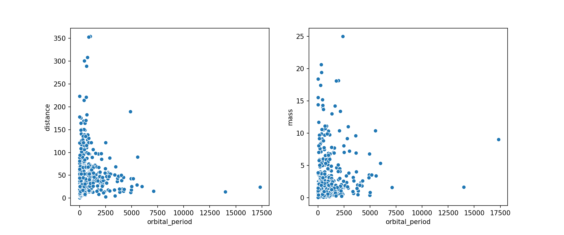
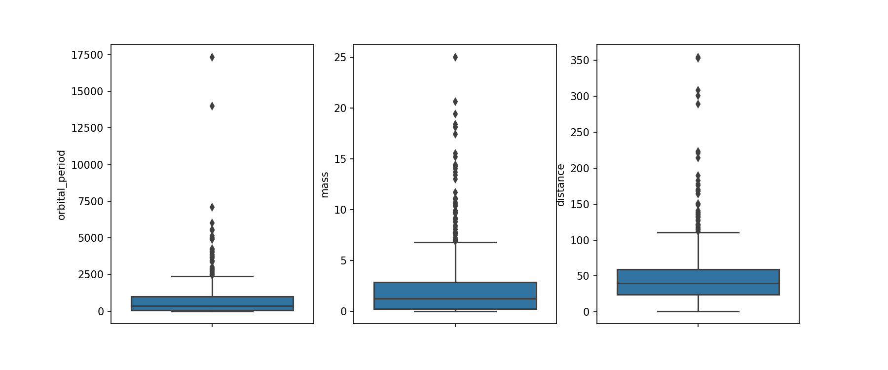
We have a few data points that might be outliers, but they could also be planets that just have very long orbital periods. We'll make some box plots to see how these outlying values compare to the median of the distributions.
# Box plot

# Create axes and figure objects
fig, (ax1, ax2, ax3) = plt.subplots(1,3, figsize=(12, 5));

sns.boxplot(y=planets_drop["orbital_period"], ax=ax1)
sns.boxplot(y=planets_drop["mass"], ax=ax2)
sns.boxplot(y=planets_drop["distance"], ax=ax3)

fig.show()
Challenge
For this challenge, you can choose to explore a dataset you are already somewhat familiar with. Check for missing values, think about what you should do with them, and then make some plots to help identify outliers.
Additional Resources
Objective 02 - use scikit-learn for decision trees
Overview
Decision trees are a type of supervised learning that can be used for both classification and regression problems. Their advantages are that they are easy to understand and visualize, and can handle both numeric and categorical data.
Decision Tree Basics
A decision tree algorithm is pretty straightforward. We have a data set that we split or fork by asking a series of questions. The data is evaluated at each question, or node, and then split according to the answer to that question. Each split is called a branch, and each branch ends in a node.
So how do we decide what to split the node on? Since decision trees can be used for both regression and classification tasks, we use two different methods to split on a node. For a regression task with continuous variables, we minimize the variance of the values. For a classification task, the Gini impurity is used to measure the "purity" of the split. If all the values belong to one class the node has the maximum purity.
A decision tree can have as many layers as needed. Usually a node has two branches, but it can have more. We stop branching when there is no reduction in either the variance or the Gini impurity value.
Follow Along
We'll implement a decision tree in scikit-learn with the penguins data from the previous objective. We want to classify each penguin as male or female based on the physical characteristics and the species.
# Imports!
from sklearn.compose import ColumnTransformer
from sklearn.pipeline import Pipeline
from sklearn.preprocessing import OneHotEncoder

# Use the decision tree classifier
from sklearn.tree import DecisionTreeClassifier
from sklearn.model_selection import train_test_split

# Set-up the one-hot encoder method
categorical_features = ['species']
categorical_transformer = Pipeline(steps=[('onehot', OneHotEncoder())])

# Set up our preprocessor/column transformer
preprocessor = ColumnTransformer(
    transformers=[
        ('cat', categorical_transformer, categorical_features)])

# Add the classifier to the preprocessing pipeline
pipeline = Pipeline(steps=[('preprocessor', preprocessor),
                      ('classifier', DecisionTreeClassifier())])
# Load in the data!
import pandas as pd
import seaborn as sns
penguins = sns.load_dataset("penguins")
penguins.dropna(inplace=True)
# Select features
features = ['species', 'bill_length_mm', 'bill_depth_mm', 'flipper_length_mm', 'body_mass_g']
X = penguins[features]
# Encode the 'sex' column
from sklearn import preprocessing
le = preprocessing.LabelEncoder()
penguins['sex_encode'] = le.fit_transform(penguins['sex'])
# Set target array
y = penguins['sex_encode']
# Apply the pipeline
# Separate into training and testing sets
X_train, X_test, y_train, y_test = train_test_split(X, y, test_size=0.25)
# Fit the model with our logistic regression classifier
pipeline.fit(X_train, y_train)
print("model score: %.3f" % pipeline.score(X_test, y_test))
model score: 0.417
It looks like we have a model that performs slightly better than the logistic regression model from earlier!
Challenge
The decision tree classifier has several parameters that can be adjusted. Another extension on this objective would be to change the features that the model is trained on. Try removing the encoded categorical columns and train only using the numeric columns.
Additional Resources
Objective 03 - get and interpret feature importances of a tree-based model
Overview
When we evaluate a linear model we look at the coefficients for each of the parameters and analyze the importance of each parameter to the model. Decision tree models don't have coefficients. Instead we look at feature importance when interpreting a model.
The overall importance of a feature in a decision tree has a relatively simple interpretation. For the tree we go through all of the splits for which the feature was used and then determine how much it has reduced the variance or Gini index compared to the parent node. If the feature has a large share of the reduction, then it has a greater importance for the model. Another way to look at feature importance is as a measure of how early and often a feature is used for the tree's "branching" decisions.
Like most predictive modeling tools and techniques, feature importances are useful but have trade-offs. For example, they can make assumptions and be misinterpreted. We'll continue to discuss this throughout this module and subsequent sprints.
Follow Along
In this section, we'll implement a decision tree model on a new data set about wine quality. This data is available with the scikit-learn dataset library.
The wine dataset is a classic and very easy multi-class classification dataset.
- Three classes with samples per class of:
[59,71,48] - Samples total - 178
- Dimensionality - 13
- Features - real, positive
The goal is to classify wine into one of three classes using the characteristic features such as alcohol content, flavor, hue, etc.
# Import libraries and data sets
from sklearn.datasets import load_wine
import pandas as pd

# Load the data and convert to a DataFrame
data = load_wine()
df_wine = pd.DataFrame(data.data, columns=data.feature_names)
df_wine['target'] = pd.Series(data.target)

display(df_wine.shape)
df_wine.head()
(178, 14)| alcohol | malic_acid | ash | alcalinity_of_ash | magnesium | total_phenols | flavanoids | nonflavanoid_phenols | proanthocyanins | color_intensity | hue | od280/od315_of_diluted_wines | proline | target | |
|---|---|---|---|---|---|---|---|---|---|---|---|---|---|---|
| 0 | 14.23 | 1.71 | 2.43 | 15.6 | 127.0 | 2.80 | 3.06 | 0.28 | 2.29 | 5.64 | 1.04 | 3.92 | 1065.0 | 0 |
| 1 | 13.20 | 1.78 | 2.14 | 11.2 | 100.0 | 2.65 | 2.76 | 0.26 | 1.28 | 4.38 | 1.05 | 3.40 | 1050.0 | 0 |
| 2 | 13.16 | 2.36 | 2.67 | 18.6 | 101.0 | 2.80 | 3.24 | 0.30 | 2.81 | 5.68 | 1.03 | 3.17 | 1185.0 | 0 |
| 3 | 14.37 | 1.95 | 2.50 | 16.8 | 113.0 | 3.85 | 3.49 | 0.24 | 2.18 | 7.80 | 0.86 | 3.45 | 1480.0 | 0 |
| 4 | 13.24 | 2.59 | 2.87 | 21.0 | 118.0 | 2.80 | 2.69 | 0.39 | 1.82 | 4.32 | 1.04 | 2.93 | 735.0 | 0 |
Here we have 13 features and one target column. The features are numeric so we won't need to worry about categorical encoding for this example. We first need to create our feature matrix and target array.
# Separate into features and target
X = df_wine.drop('target', axis=1)
y = df_wine['target']

# Import train_test_split function
from sklearn.model_selection import train_test_split

# Split dataset into training set and test set
X_train, X_test, y_train, y_test = train_test_split(X, y, test_size=0.25)
# Use the decision tree classifier
from sklearn.tree import DecisionTreeClassifier
# Instantiate the classifier
classifier=DecisionTreeClassifier()
# Train the model using the training sets
classifier.fit(X_train,y_train)
# Find the model score
print("Decision tree model score: %.3f" % classifier.score(X_test, y_test))Decision tree model score: 0.933We fit a decision tree model! The results look good. The model seems to be able to predict the class of wine quite well given the 13 characteristics. Now, let's look at feature importance. We do this by plotting each feature's contribution to the model on a bar chart. The total contribution of all the features is normalized to 100 (or sometimes 1), so each feature is some percentage of that.
# Plot the feature importances
import matplotlib.pyplot as plt

importances = pd.Series(classifier.feature_importances_, X.columns)

# Plot top n feature importances
n = 13
plt.figure(figsize=(10,n/2))
plt.title(f'Top {n} features')
importances.sort_values()[-n:].plot.barh()

plt.show()
<Figure size 720x468 with 0 Axes>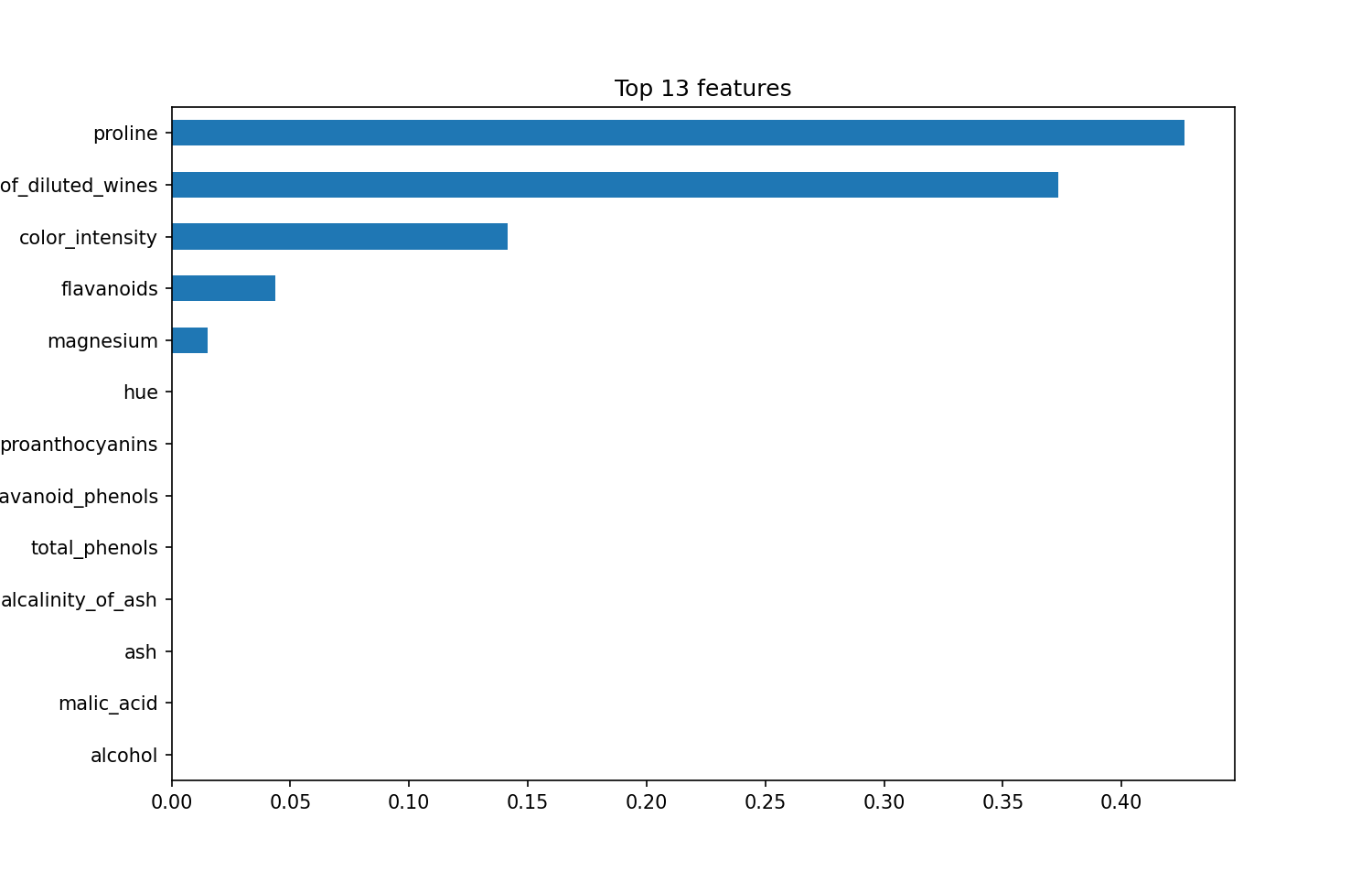
For our model, it looks like the top three features contribute the most to the model, by a significant fraction.
Challenge
For the above model, we used the default parameters. Using the scikit-learn documentation, explore some
of the other parameters. Using the above code, run the model again, but with different parameters. A few
to try would be criterion (how to split) and the max_depth (how many nodes).
Additional Resources
Guided Project
Open JDS_SHR_221_guided_project_notes.ipynb in the GitHub repository below to follow along with the guided project:
Guided Project Video
Module Assignment
Complete the Module 1 assignment to practice decision tree techniques you've learned.
It's Kaggle competition time! In this assignment, you'll apply what you've learned about decision trees to a real-world dataset.
Getting Started with Kaggle
If this is your first time using Kaggle, here's how to get started:
- Create an Account: Visit Kaggle.com and register with your email
- Join the Competition: Navigate to the competition page and click "Join Competition"
- Download Data: Go to the "Data" tab and download the dataset files
Watch this walkthrough video for detailed instructions:
Additional Kaggle Resources
Assignment Solution Video
Resources
Documentation
- Scikit-learn: Decision Trees
- Scikit-learn: Imputation of missing values
- Pandas: Working with missing data