Module 4: HTML and CSS III
The Cascade
As implied by the name (Cascading Style Sheets), the cascade lies at the core of CSS. Cascading gives a lot of power to the developer. By understanding the concepts and rules of the cascade, you will be able to change the scope of styles (e.g., expand coverage to other elements, restrict style to particular sections) and save lots of time during customizations, testing, and debugging. Mastering cascade will enable you to have complete control of the styling behavior in your code, achieving consistency and upgradability.
Here's a common scenario. The developer has started with some basic styling by using a third-party stylesheet, which automatically sets the “tone” for the web page, making sure everything is visible, neat, and proportional. This is often accomplished by using open-source stylesheets or buying professional templates. But the developer wants to customize some fonts and colors and create her own “theme” without having to go back to the original stylesheet to search for and replace dozens of styles (that would be very impractical).
Through the extensibility of CSS, particularly the cascade, the developer can quickly update styles in a fast and predictable manner.
Keep going and it all will make sense. Here's a little incentive: job interviews usually involve one or two tricky questions about cascading!
Determine which conflicting syle wins
Often, an element in the web page has its property style set by more than one declaration. The conflicting
declarations may come from the same stylesheet, from inline styles in the HTML code, CSS code between
>style< tags or even from different .css files.
This is not necessarily bad. In fact, this is the whole point of cascading, as it allows styles to be overridden, updated, adjusted, or improved as desired. But if you have multiple declarations for the same property of the same element, which one will be effectively used? In this example, two CSS files are imported into the project:
File: template.css
p {
  font-size: 15px;
}
File: tweaks.css
body {
  font-size: 10px;
}
Paragraphs are part of the body, so both declarations end up targeting <p>. Which font
size will be actually used?
When there are conflicts and multiple declarations target the same element, the cascading algorithm will analyze the origin of declarations, their importance, and specificity to make a decision and determine the “winning” style. We could even define cascade as "the fight" to settle a value of a CSS property for an element.
Let's start with the three origins of style sheets: browser, user, and developer (author).
Browsers define some styles “under-the-hood” to offer a basic look and feel in case the developer does not explicitly create them. The browser assigns styles to elements such as the default font and size, document margins, and paragraph spacing.
User styles used to be a big thing many years ago when web design was not very mature. Users needed a way to customize or even fix some styles.This practice is not common at all these days. In fact, some browsers have already disabled this functionality, so we won't be talking much about user stylesheets.
On the other hand, developer styles are where the action happens, whether they are internal (inside
<style> tags) or external in a .css file.
The algorithm will first look into origin and importance to determine which conflicting declaration takes priority:
- Origin and Importance: if no declarations are marked as
!important, the priority order (a.k.a precedence) is DEVELOPER style sheets over USER style sheets over BROWSER stylesheet. Styles injected by the browser are the weakest, in the sense that they are readily overruled by any styles created by the developer, regardless of the selector used. Any origin could override a developer style by using!importantlike this:
a { color: red !important; } - Next, within the same origin, precedence is defined by specificity. We will cover this in the next Learning Objective.
- Finally, if the declarations are still conflicting (same specificity), the decision is made by order of appearance. The last one will take priority.
How to Build It
ACME realizes that the default browser styling is really basic and is not helping the development at all. Besides, when testing the website on different browsers (e.g., Firefox, Chrome, Brave), there's no consistency with font sizes and paragraph spacing, as if each browser had its own signature style.
By knowing the origin rules and declaring some new styles, the developers will be able to override the browser's stylesheet and be sure that the page will be rendered consistently in any browser. ACME will add the following styles to improve the website under development and try to meet some client's requirements:
<style>
p {
  font-size: 15px;
  margin: 35px;
}
title {
  font-size: 25px;
}
nav {
   border: 2px solid;
}
a {
  color: red;
}
nav a {
  color: gold;
}
#client {
  color: blue;
}
.big {
  color: green;
}
a:hover {
  color: pink;
}
</style>
<title> Client Corporation Home Page </title>
<nav>
   <a id="client" class="big" href="https://www.client.com">Learn More</a>
</nav>
<body>
   <p> Page under construction! </p>
</body>
Upon refreshing the page, ACME confirms that the new styles for paragraphs, title and navigation are working consistently among browsers. But some colors don't seem to be right. The client wanted the nav links to be green, but they are currently blue. While experimenting with the link color, ACME found itself using different types of selectors: elements, classes, and IDs. Maybe that's the issue.
Of course, an element cannot be red, gold, blue and green at the same time. If different CSS rules exist in our style sheets, competing to set a color on the same HTML element, there can only be one winner.
We already know how the cascading algorithm deals with origins. It is time to learn about specificity to fix the styling above and avoid further issues.
Selectors and specificity
Given that the developer stylesheet has higher precedence over other origins, most of the time the specificity inside the developer's stylesheet will be the cascade deciding factor.
As a developer, you can edit your .css files directly, but in practice you will be using the browser's developer tool while testing and debugging, as this tool simulates editing the developer stylesheet.
Specificity is directly related to selectors. Recall that selectors are really a pattern to select elements to which rules - or styles - are applied.
By the way, selectors are not only used for styling, but are also crucial for manipulation and testing of elements in a web page.
In the example below:
a { /* type selector */
  color: red;
}
The color 'red' is applied to any link.
While in this other example:
nav a { /* 2 type selectors */
  color: gold;
}
The color 'red' is applied to links inside the navigation section, making it more specific than the previous declaration. It would be natural to understand that the second declaration, being more specific, wins the battle and overrides the first declaration for elements inside the nav section.
All other links outside of nav will still be red, assuming there are no other CSS styles. That's because the conflicting style is for links inside the nav, which are a subset of general links. Links outside the nav are not conflicting with any other declaration at this point.
As a general rule, specificity increases according to this order:
- The * (universal selector) would be the least specific
- Type selectors would be more specific
- Class, pseudo-class or attribute selectors would be even more specific
- ID selectors would be the most specific
The higher the specificity, the higher the weight, or precedence, or priority. More specific declarations always override less specific declarations.
How to Build It
Let's revisit ACME's code to try and figure out what went wrong:
HTML:
<title> Client Corporation Home Page </title>
<nav>
   <a id="client" class="big" href="https://www.client.com">Learn More</a>
</nav>
<body>
   <p> Page under construction! </p>
</body>
CSS:
a { /* type selector */
  color: red;
}
nav a { /* 2 type selectors */
  color: gold;
}
.big { /* class selector */
  color: green;
}
#client { /* ID selector */
  color: blue;
}
a:hover { /* pseudo-class selector */
  color: pink;
}
We can now understand why the homepage link color is blue instead of green. An element selected by ID is much more specific than a class of elements, as it represents a single element in the page. There are multiple conflicting declarations in the code: #client is a link element, inside a nav section, which is also part of the .big class, and all declarations set the link color. In other words, if you remove the #client styling, .big becomes the most specific. Remove .big and 'nav a' will take precedence.
For now, these are a couple of additional rules to be aware of:
- The selectors above would be beaten by a style applied inline in the HTML:
<a style="color:purple;" href="https://www.client.com">Learn More</a> - And even an inline style would be beaten by a style using !important
/* You can't override this style, even if you tried to be more specific. Every single link in the website will be of tomato color, in any section, for any class or ID. */
a {
  color: tomato !important;
}
When using Chrome Dev Tools (or virtually any browser dev tool), declarations that have lost the battle (overridden) will appear crossed out in the Styles sub-tab of the Elements tab.
body {
  box-sizing: border-box;
  margin: 0;
  padding: 0;
  background-color: #eddfd6;
  background-color: # var(--primary color);
  color: #222
  color: var(--secondary-color);
  font-size: 14px;
}
The background color for the body has been overridden by a conflicting declaration targeting the same element (body) and the same property (background color). The last one takes precedence (order of appearance).
ACME decides to edit the #client styling and go with this version:
/* no styling for 'a' - links will be styled by the browser stylesheet */

nav a { /* links inside nav should be gold */
  color: gold;
}

#client { /* this specific hone page link should be green */
  color: green;
}

a:hover { /* any link should become pink when hovered, so make sure there are no conflicting declarations with more specificity or later order of appearance */
  color: pink;
}
So you may be asking yourself, “How do I make the right selector?” Glad you asked! You will learn how to craft the perfect selector in the next Learning Objective.
Crafting a selector
The time has come to craft your first CSS selector! Crafting the right Selector for a style declaration takes a bit of logic in the beginning because each selector has weight, or priority in the cascade, in four different groups. You can break CSS Selector elements into these 4 groups to see which styles will take priority in the cascade. Let's take a look at an example of a CSS selector:
Example, Declaration A:
p.bright {
   color: blue;
}
You can break down the above CSS Selector into 2 parts: a class selector (.bright) and an element selector (p). Let's put these into our four groups to see this selector's weight:
| HIGHEST PRIORITY | HIGH PRIORITY | LOW PRIORITY | LOWEST PRIORITY |
| HTML Inline | ID Selector | Class Selector | Element Selector |
| 0 | 0 | 1 (bright class) | 1 (p element) |
So this particular declaration's weight is A: 0,0,1,1.
For this next, Declaration B:
body p {
   color: red;
}
The weight is B: 0,0,0,2 (two element selectors, body and p)
If both declarations target the same element in the webpage, such as a paragraph inside the body with a class 'bright', one style has to take priority over the other. To determine which one will win, we start comparing from left to right (highest to lowest priority):
| HIGHEST PRIORITY | HIGH PRIORITY | LOW PRIORITY | LOWEST PRIORITY | |
| A | 0 | 0 | 1 | 1 |
| B | 0 | 0 | 0 | 1 |
| Equal, compare next... | Equal, compare next... | 'A' wins; no need to compare further |
The first declaration wins because it's more specific: a class beats any number of elements.
| Examples | Specificity | Comments |
| h1 {color: blue;} | 0, 0, 0, 1 | 1 element |
| ul li {color: green;} | 0, 0, 0, 2 | 2 elements |
| .danger {color: red;} | 0, 0, 1, 0 | 1 class |
| a[target] {color: brown} | 0, 0, 1, 1 | 1 element and 1 attribute |
| p.bright {color: white;} | 0, 0, 1, 1 | 1 element and 1 class |
| p.bright em.dark {color: yellow;} | 0, 0, 2, 2 | 2 elements and 2 classes |
| #title {color: brown;} | 0, 1, 0, 0 | 1 ID |
| style="color:pink;" | 1, 0, 0, 0 | 1 HTML inline |
Experimentation in the browser will help you master this in no time! And remember: any declaration marked as
!important will automatically win, regardless of weight.
Rules of thumb when deciding what selector to use:
- One needs to craft selectors that are specific enough, but not crazy specific.
- ID selectors are very heavy (high priority). Consider using an attribute selector instead to select by ID, otherwise you won't have much room for overrides in the future. Imagine having to resort to HTML inline and edit hundreds of lines.
/* attribute selector */
[id=client] {
  color: yellow;
}
/* ID selector */
#client {
  color: yellow;
}
In practice, both will render the same styling for the link. But the attribute selector can still be easily overridden with an ID selector in the future.
- Avoid the use of inline styles. At least for now.
- Refrain from using
!importantas it is impossible to override, regardless of where it's declared. Especially if it is used for a broad, light, non-specific target. This could become a debugging mess very quickly.
How to Build It
ACME wants to improve the styling, by choosing selectors that are not too specific. The developers are also
planning for a future professional template, so they decide to create separate .css files to
better manage the cascade.
File 1: development.css This will be imported first in the HTML.
p {
  font-size: 15px;
  margin: 35px;
}
title {
  font-size: 25px;
}
These two declarations are temporary and will be certainly overridden by the theme, as long as the theme is imported after them (order of appearance).
File 2: theme.css Not being used right now, but we need to create a placeholder in the HTML file so that this file is imported in the right spot.
File 3: overrides.css Last import, will possibly override some theme declarations, and that's the point.
.navborder {
  border: 2px solid;
}

[homelink] {
  color: green;
}

a:hover {
  color: pink;
}
ACME's client wants a particular nav border no matter what. We will use a class with a safe name (one that the theme will likely never use).
For the green link, we'll use an ID attribute selector with another custom name.
Client wants all links to be pink when hovered. If we use a class selector, we will have to add the class
attribute to every single link in the HTML. So let's make sure this is declared after the theme import, to
override a possible a:hover declaration in the theme.
Let's look at the HTML used before, with the title, nav, link and paragraph. This time, though, the code is more complete, with all the standard tags, and the three CSS import statements inside the head section.
File 4: index.html
<!DOCTYPE html>
<html>
<head>
<link rel="stylesheet" href="development.css">
/* Placeholder for future theme */
/* <link rel="stylesheet" href="theme.css"> */
<link rel="stylesheet" href="overrides.css">
<title> Client Corporation Home Page </title>
</head>
<body>
<nav class="navborder">
   <a id="homelink" href="https://www.client.com">Learn More</a>
</nav>
<p>Page under construction!</p>
</body>
</html>
Conclusion
The whole point of using CSS styles is to facilitate development and updates. If you follow best practices and understand the cascade algorithm, your code will be reusable, consistent, upgradeable, and easy to read and debug.
In most cases, specificity and order of appearance will dictate the cascading. Use the browser's dev tool to inspect elements quickly and visualize overrides.
By using separate .css files, you can assign declarations to different groups: Temporary styles used for development, which can be overridden or even discarded in production with no significant impact on the project. Third-party themes can be tried and replaced at any time. Intentional overrides will implement specific needs and can be quickly edited without having to mess with any third-party templates.
When you're ready, access CSS Diner to memorize the most commonly used selectors while experimenting with specificity. Happy styling!
The Box Model
As you progress through CSS styling, let's shift our focus for a moment and talk about layout. Specifically, you will learn how to style and place elements in the page using the Box model and its display modes.
Whether you it's clearly visible or not in the page, most HTML elements are internally wrapped in a box consisting of:
- Content
- Padding
- Border
- Margin
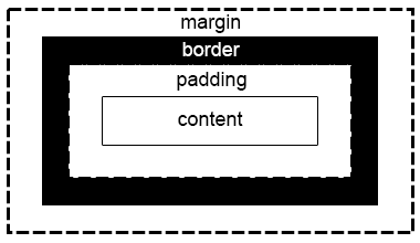
And every one of those properties can have their own style: size, color etc. Sometimes our elements do not end up where we intended them to be. By understanding the flow rules - how elements are placed in relation to one another - and leveraging the box model capabilities, you will be able to layout pages exactly as you design them!
Granted, there are more advanced techniques that will facilitate the layout (such as the Flexbox covered in the next Learning Objective). Still, as a developer, you should learn the fundamental concepts of the box model to be able to customize and debug any implementations that you come across.
The flow of elements
Before we dive into the box model and its properties (e.g. padding, border, margin), letps realize that most
HTML elements have a property called display, which defines how this particular element will be
placed in relation to other elements around it.
There are three display modes: inline, block, and inline-block.
Block-level elements are vertically oriented: they stack on top of each other. Think Lego blocks, or paragraphs in a book. Inline-level elements are horizontally oriented: they sit next to each other. Think words within a paragraph.
In this example below, any element with a class attribute “callout” will display inline:
span.callout {
  display: inline; /* the default for span */
  width: 100px;
  height: 100px;
  padding: 5px;
  border: 2px solid green;
  background-color: yellow;
}
If you write this HTML code using the CSS above:
<p>Lorem ipsum dolor sit amet, consectetur adipiscing elit.<span class="callout">Aliquam</span><span class="callout">venenatis</span>gravida nisl sit amet facilisis.</p>
You will get:
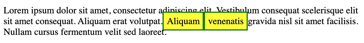
As expected, both span boxes are inline with the other elements around it. Inline elements will honor padding left & right, creating the necessary spacing to the elements before and after them. But not top & bottom, incurring a possible vertical overlap, like in the example above. By default, they only use the width necessary to accommodate their own content.
Some examples of elements that are inline-level by default are: a, span, strong, b, and i.
Let's see what happens when you change the display property to block:
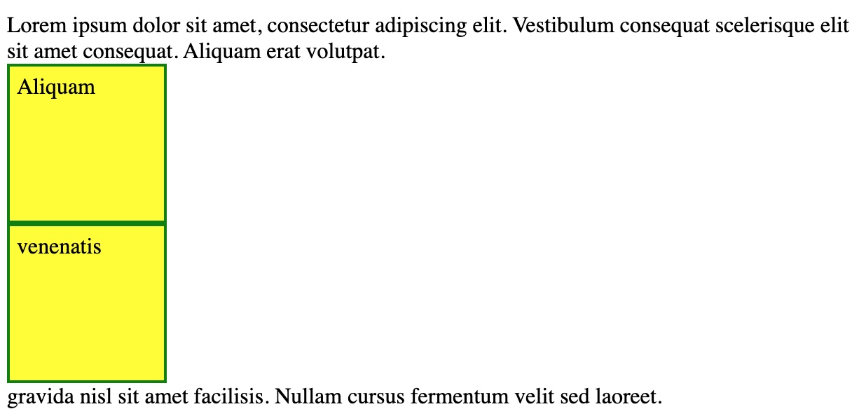
The boxes are now stacked one over the other. Block elements automatically begin in a new line and do not accept elements beside them. The width and height properties, if present, are respected. By default, the element will take the whole width of the parent container, when no width is defined.
Some examples of elements which are block-level by default are: div, h1, p, section tags.
Can you guess what happens when you change the display mode to inline-block?
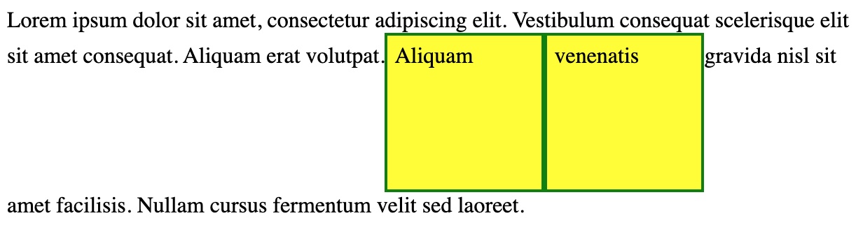
It's like you get a bit of both. Box sizes are respected (if present), and they are inline with the rest of the paragraph, but line spacing is automatically adjusted to fit the whole box and maintain the box content (text) aligned.
If you understand the flow of elements for each display mode, and realize that HTML elements have a default display property, you will know why elements position themselves the way they do.
How to Build It
ACME is trying to place several images vertically in the layout, but they always end up positioned side by side. The developers realized that the default display mode for images is inline. They change it to block:
CSS:
img {
  display: block;
  width: 150px;
}
HTML:
<img src="image1.jpg">
<img src="image2.jpg">
<img src="image3.jpg">
Sure enough, the images are now stacked over each other. By setting the width of all images to 150px, the layout will look like a fixed width column, regardless of the actual width or orientation of each picture. Nevertheless, they don't look right yet. The layout needs some spacing, maybe a border around each image.
The box model
The properties of the box model are pretty intuitive:
- Content is often text and by default will take the space necessary to fit all words in that particular font size.
- Padding is a “breathing space” that usually makes text look better. You don't need a border to benefit from padding, but you certainly want to use padding when creating a border, otherwise the border will touch the text. The padding boundary is also the boundary for the content background color.
- Border is the outermost layer of the element, usually in a color distinct from the background, to visually “frame” the element.
- Margin is the actual spacing between the element and other elements around it.
Tip: If your content's background color is the same as the parent container's background color, and you are not using any border, you could certainly use padding to simulate margin. But avoid this practice as the styling might change in the future. Always consider the complete box model when designing the layout.
How to Build It
The developers at ACME were able to place the images vertically, but they could definitely use a little styling.
img {
  display: block;
  width: 150px;
  padding: 5px;
  border: 2px solid #ddd;
  margin: 10px;
}
By setting some additional properties, the images now look much better!
As you've seen, we can also set width and height for elements. But then again, things might not work exactly as expected. We will cover this in our next Learning Objective.
Box sizing
By default, the width and height assignable to an element using CSS applies to the element's inner content (or content box). This is inconvenient in many scenarios, especially when we are trying to align multiple elements with different font sizes, paddings and borders.
Fortunately, you can change the box sizing behavior so that the width and height of an element will refer to the content box + padding + border.
In most cases, this will greatly facilitate layout design and implementation. So instead of changing this property for every single element in our page, we can go ahead and declare the box sizing property globally like this:
*, *::before, *::after {
  box-sizing: border-box; /* instead of the default content-box */
}
Don't worry about the ::before and ::after pseudo-elements for now. This declaration is making sure that any element, in any container or position in the page, will have its width and height properties account for padding and border.
Here's an example scenario using the default content-box:
If we have four elements forming a line, and we set each element's width to be 25% of the width of the parent, we would expect all elements to fit in the same line, and total 100% of the width of the parent. But that is not what happens: as soon as we add border or padding to any element, we exceed the rendered 100% width of the parent element. If we had border-box mode active, the content box would actually resize (shrink) to accommodate the new border and padding, so that the final width of the element would remain 25% of the parent's width.
The border-box mode makes the sizing of elements with CSS more predictable and intuitive.
How to Build It
The client really liked the image frame styling and vertical look. But the developers soon found out that the pictures lost alignment when they created a new class for some of the pictures, using different values for padding and border. The developers decide to set border-box for the img elements, so that the pictures will always be aligned:
CSS:
img {
  box-sizing: border-box;
  display: block;
  width: 150px;
  margin: 10px;
}
img.a {
  padding: 5px;
  border: 2px solid #ddd;
}
img.b {
  padding: 10px;
  border: 10px solid #ddd;
}
HTML:
<img class="a" src="image1.jpg">
<img class="b" src="image2.jpg">
<img class="a" src="image3.jpg">
With 10px of padding (20px total) and 10px of border (20px total), the second image will automatically resize to take up 110px horizontally, so that the final width is still 150px.
Looks like the developers are really taking control of the layout!
Conclusion
Many experienced developers still struggle to place elements in the page, because they never took the time to really understand these fundamental concepts.
Try to develop a consistent approach to layout design: always start in border-box mode, decide if an element should be block-level or inline-level, and remember that padding is not margin.
Simple and effective layouts can go a long way! Sometimes all you need is better alignment, some padding, a little border and creative colors.
Intro to Flexbox
As Web Development matured over the years, HTML and CSS have been incorporating new functionalities constantly. CSS level 1 was first released in 1996 and has evolved to what is now called CSS3: an ever-growing collection of modules, instead of a large specification.
Flexbox was introduced in 2009 as a new layout module for CSS3, with the goal to help us build responsive web pages and organize page elements easily. Since then, it's gained more and more attention, becoming the main layout system for modern web pages.
Flexbox is a one-dimensional layout system that we can use to create a row or a column layout. In a way, it is an evolution of the block-level and inline-level concepts. It makes our life easier to design and build responsive web pages that should render nicely on any device, with any screen size or orientation (e.g. smartphones). And all of that, without having to use tricky hacks in our CSS code.
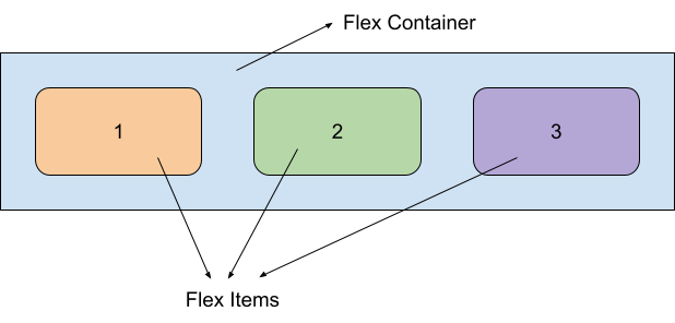
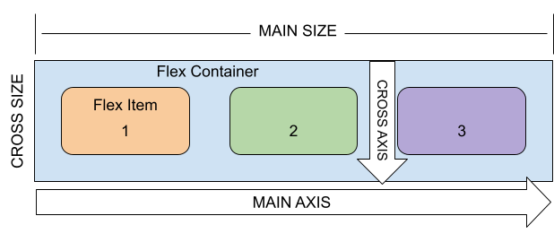
The flex container
With Flexbox, It all starts in a Flex Container.
When a container is configured to behave as a flex container, every child element will be automatically distributed inside the parent container, saving us a lot of trouble trying to calculate, update and hard-code values. Properties like margin, width, height, padding and absolute position can be optimally created on the fly, rendering a perfectly aligned and spaced layout.
Whenever you add a new element, or change an existing one, all the other elements are dynamically repositioned to maintain balance and adhere to any constraints defined by the developer. It does look too good to be true!
To be a flex container, an element must have its display property set to flex:
CSS:
.numbers-container {
  border: 1px solid black;
  display: flex;
}
HTML:
<div class="numbers-container">
  <div>1</div>
  <div>2</div>
  <div>3</div>
</div>
This explicitly turns the parent div into a flex container and implicitly the children into flex items, which means you don't have to set any additional property for the children. Just like that, your layout will be like this:
Of course, in this example all you get is simply:
123
But we will see how to make this look great in a second.
By default, the flex box container will distribute its children along the horizontal axis. It will behave like a row. But we can change the main axis to be vertical, by setting the flex-direction property:
.numbers-container {
   border: 1px solid black;
   display: flex;
   flex-direction: column;
}
For this result:
1
2
3
Flex direction can also be set to reverse-column and reverse-row, which are self explanatory.
The axis perpendicular to the main-axis is called cross-axis. The reason there are two axes will become clear soon, but let's just say for now that they will allow for many possibilities of distributions and alignments.
Besides the parent (flex container), its children elements (flex items), the flex direction, the main axis and the cross axis, with Flexbox there are also the concepts of “main size” and a “cross size”. They represent the parent container's size.
Flexbox unlocks the ability to build layouts much more easily. In fact, you can treat any child as a new flex container, with its own flex items, to design complex layered layouts!
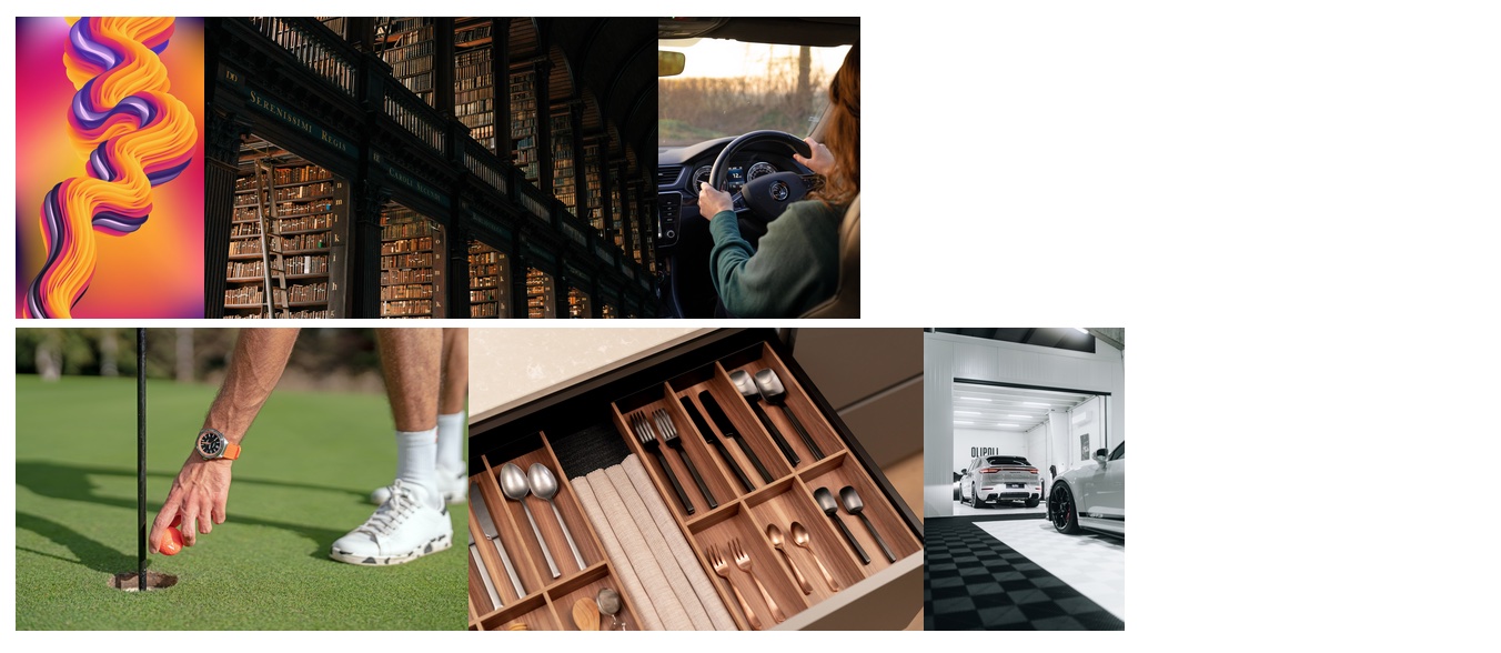
Think blog pages: the left-side vertical section has a subscribe button and a categories menu. The right-side section, in a different style, has a summary of the latest three posts. The header has logos and links. The footer has got some copyright and contact information. And the main central section displays the author name, date, title and post content. Each one of those sections could be (and probably is) a flex container.
How to Build It
ACME spends a lot of resources to fix the layout every time the client has a new request. As they say: coding is 10% writing, 90% debugging.
Flexbox should help the developers create a dynamic layout for the images, which can work in different orientations and is easy to code.
They try this:
CSS:
.images-container {
  display: flex;
}

img {
  height: 150px;
}
HTML:
<div class="images-container"> /\* First row \*/
  <div><img src="img\_1.jpg"></div>
  <div><img src="img\_2.jpg"></div>
  <div><img src="img\_3.jpg"></div>
</div>

<div class="images-container"> /\* Second row \*/
  <div><img src="img\_4.jpg"></div>
  <div><img src="img\_5.jpg"></div>
  <div><img src="img\_6.jpg"></div>
</div>
They go with a row layout (default flex-direction) to make better use of the space: images are distributed horizontally, with a height of 150px. They figure a row can probably fit three images, so they create two row flex containers, one above the other.
Still, not quite what they had in mind. With Flexbox, they should be able to quickly experiment and change the design.
Interestingly, the developers recall that is a block-level element by default (not inline), so how are the flex items supposed to be laid side by side inside the flex container? Yet, they are. Let's find out why.
Distributing flex items along the main axis
We already know how to create flex containers and choose the main axis. Now it is time to actually learn how to control the position of the flex items!
First of all, once we set display flex on a container, block-level elements immediately nested inside the container stop behaving as blocks. So it really doesn't matter if the child display property is block, inline or inline-block. The flex-direction will dictate the distribution. This is great, so you don't have to worry about block-level or inline-level elements, it just works with any!
But the final layout might not look exactly how you wanted, since the flex items are distributed using a default pattern. You can place them in many different ways through the 'justify-content' property.
- flex-start is the default, child items are packed at the start of the main axis.
- flex-end, child items are packed at the end of the main axis.
- center, child elements are packed at the center of the main width.
- space between, no gutter at the beginning nor at the end of the container.
- space around, half the gutter at the beginning and at the end of the container.
- space evenly, all gutters are the same
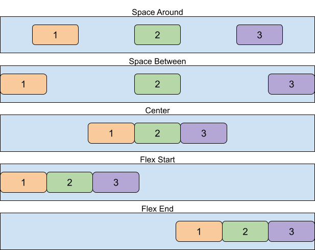
Just by using justify-content, you will be able to solve potentially complex problems, like centering and spacing, instantly!
And it's as simple as adding a CSS property to the target container. You don't even have to worry about any flex item (child) property.
How to Build It
The developers at ACME will be able to quickly try different layouts for the images.
.images-container {
  display: flex;
  justify-content: space-around;
}

img {
  height: 150px;
}
They ultimately go with space-around, as it seems to be working best!
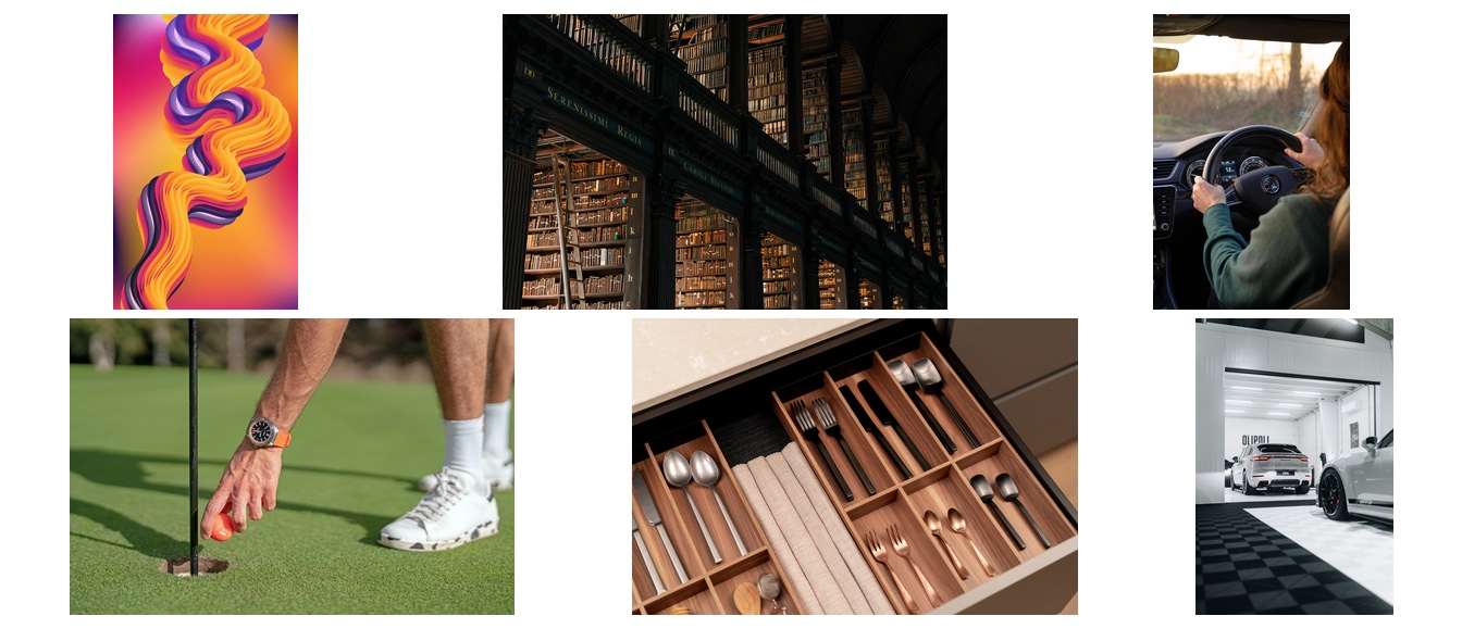
Maybe it's time to bring back the “picture frames” that worked in the past. The devs also decide to set up border and height for the flex containers:
.images-container {
  height: 250px;
  border: 2px solid black;
  display: flex;
  justify-content: space-around;
}

img {
  height: 150px;
  padding: 5px;
  border: 2px solid #ddd;
}
Alright, definitely some improvements, but they now need to align the pictures vertically. Next, we'll see how to further customize the position of flex items using the cross-axis.
Distributing flex items along the cross axis
Flex items can be anything, and often have different sizes and types of contents. We not only want to distribute them along the main axis (justify), but also align them along the cross axis, for a better layout:
Fortunately, flex containers have another property exactly for that: 'align-items'. These are the possible values:
- flex-start, child items are packed at the start of the cross axis.
- flex-end, child items are packed at the end of the cross axis.
- center, child elements are packed at the center of the cross width.
- stretch, (default) the flex items stretch to fill the cross width (as long as the flex item has no explicit size limitation)
- baseline, flex items inherit alignment from their text.
How to Build It
Again, experimentation is the best way to decide, especially when it's that easy to do it:
.images-container {
  margin: 20px;
  height: 250px;
  border: 2px solid black;
  display: flex;
  justify-content: space-around;
  align-items: center;
}

img {
  height: 150px;
  padding: 5px;
  border: 2px solid #ddd;
}
The developers settle for center alignment and take the opportunity to add some margin to the containers.
How about we finish this Core Competency exploring some other properties to fine-tune the flex items?
Flex items
At this point, you can probably tell that the Flexbox is a great way to layout elements. It's effective and easy to use!
But you can do much more with Flexbox. Why don't you explore some other properties?
Here are some suggestions to try for the container:
- flex-wrap: wrap; - Flex items will wrap onto multiple lines, from top to bottom, so you don't have to worry if all children will fit in a single row.
- align-content - This aligns the flex container's wrapped lines when there is extra space in the cross-axis, similar to how justify-content aligns individual items within the main-axis.
And some suggestions to experiment with the items:
- flex-grow - To choose which items should take up more space so that the whole main axis is filled up.
- align-self - Allows a particular item to override the value of align-items.
Refer to this site for more information!
How to Build It
The devs realize that wrapping the images in a single container might be exactly what they need. With some final touches, the picture section looks great and is ready to accept new images at any time!
CSS:
.images-container {
  padding: 20px;
  margin: 20px;
  border: 5px solid black;
  display: flex;
  flex-wrap: wrap;
  justify-content: space-around;
  align-items: center;
}

img {
  height: 150px;
  padding: 5px;
  border: 2px solid #ddd;
  margin: 5px;
}
HTML:
<div class="images-container">
  <div><img src="img\_1.jpg"></div>
  <div><img src="img\_2.jpg"></div>
  <div><img src="img\_3.jpg"></div>
  <div><img src="img\_4.jpg"></div>
  <div><img src="img\_5.jpg"></div>
  <div><img src="img\_6.jpg"></div>
</div>
With a single container and automatic wrapping, they can remove the flex container's margin and add some padding. A thicker border will also look nice. Finally, they add some margin to the flex items to create some space between them:
Conclusion
Flexbox Layout module is a group of CSS properties used together to distribute elements within a parent element, along an axis. It can be used for small-scale layouts, or for small components within a larger layout. The module is a much more efficient way to organize elements than older alternatives and is well-supported by all browsers.
Dev tools like CodePen are great for experimenting with Flexbox and get a real-time visualization of the results.
Guided Project
In this guided project, you will take a deep dive into the Cascade, which is the mechanism browsers use to determine which particular CSS style comes into effect of all the different styles that may target the same HTML element. You will also learn about the Box Model, and how elements utilize space when rendered on a page. Finally, you will unlock the secrets of Flexbox, a powerful CSS module that will allow you to position elements along a line, whether horizontal or vertical, with precision and ease. Let's do this!
Module 4 Project: HTML & CSS III
Designers spend time carefully crafting user-friendly designs. Once they finish, they need a front-end developer to precisely implement their designs into the webpage. It's the developer's job to deduce the CSS properties required to recreate the designs and make the page functional.
In this module project, you will have an image of a design you will implement. You will receive little guidance, needing to rely on your understanding of CSS concepts and properties to match the design. Take your time and plan out the page. Careful planning can be the difference between functional and finicky CSS.
The module project contains advanced problems that will challenge and stretch your understanding of the module's content. The project has built-in tests for you to check your work, and the solution video is available in case you need help or want to see how we solved each challenge, but remember, there is always more than one way to solve a problem. Before reviewing the solution video, be sure to attempt the project and try solving the challenges yourself.
If you can successfully get through all the Module Projects in a sprint, you are ready for the Sprint Challenge and Sprint Assessment, which you must pass to move on to the next Sprint.
Instructions
The link below takes you to Bloom's code repository of the assignment. You'll need to fork the repo to your own GitHub account, and clone it down to your computer:
Starter Repo: HTML and CSS III
- Fork the repository, and then use the green button and your terminal to clone the project down to your computer.
- Next, open the
index.htmlfile in both VSCode and the Chrome Browser. VSCode is where you will make code changes, and Chrome is where you will check if your code is passing all the tests. - To check the tests, right-click on a Chrome window, select "Inspect," and ensure the console is visible. Then return to VSCode and start coding a solution to the first challenge. When you want to check if your code is correct, go to Chrome and refresh the page to run the tests and see your results.